Kirsty Burgoine
Kirsty's Excellent Adventure in CSS Grid
#1about 1 minute
The evolution of CSS layout from tables to grid
CSS has evolved from table-based layouts and floats to modern methods like Flexbox and Grid, enabling more semantic and flexible designs.
#2about 3 minutes
Creating implicit and explicit CSS grids
CSS Grid automatically creates an implicit grid from content, but defining an explicit grid with `grid-template-columns` and `grid-template-rows` provides precise layout control.
#3about 2 minutes
Positioning items using named and numbered track lines
Place and span items precisely within a grid by referencing named or numbered track lines with properties like `grid-column`, `grid-row`, and the `grid-area` shorthand.
#4about 3 minutes
Using new units and functions like fr, repeat, and minmax
Leverage powerful new CSS Grid features like the fractional `fr` unit for proportional sizing, the `repeat()` function for concise definitions, and `minmax()` for responsive control.
#5about 3 minutes
Creating responsive layouts without media queries
Combine `repeat()`, `autofill`, and `minmax()` to create fluid grid layouts that automatically adjust the number of columns based on available space, eliminating the need for breakpoints.
#6about 6 minutes
Managing full-width content with the no-wrapper technique
Apply CSS Grid to the entire page to create flexible gutters and control content width, allowing elements to easily break out of the main container for full-width layouts.
#7about 5 minutes
A preview of the upcoming subgrid feature
Subgrid allows a nested grid to inherit its track definition from its parent, simplifying complex layouts and ensuring consistent alignment across components.
#8about 2 minutes
Avoiding accessibility issues with content reordering
Changing the visual order of grid items with `order` or placement properties can create a confusing experience for users of assistive technologies, so ensure the DOM order remains logical.
#9about 7 minutes
Supporting CSS Grid in Internet Explorer 11
Supporting IE11 requires using the older `-ms-` prefixed syntax, manually placing all grid items, and avoiding modern features like `repeat()` and `minmax()`.
#10about 2 minutes
Key takeaways for using CSS Grid effectively
CSS Grid is a powerful two-dimensional layout system with excellent browser support that enables flexible, maintainable, and complex designs with less code.
Related jobs
Jobs that call for the skills explored in this talk.
Matching moments

04:39 MIN
The long journey to modern CSS layout and responsive design
The State Of The Web
Unlock full access
Log in or set up an account to access this feature and more.
02:16 MIN
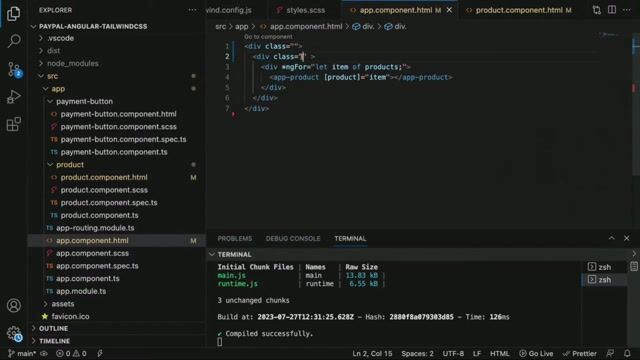
Arranging components with the Tailwind grid system
Level up your Angular CSS with Tailwind CSS
Unlock full access
Log in or set up an account to access this feature and more.

05:24 MIN
Adapting print design principles for the fluid web
WeAreDevelopers LIVE - Web Typography; CSS Layout features; Staying curious in an AI world and more
Unlock full access
Log in or set up an account to access this feature and more.
05:26 MIN
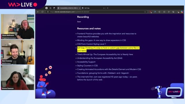
Navigating the complexities of CSS spacing and gaps
WeAreDevelopers LIVE - - Gaps in CSS, EU Accessibility Act and more!
Unlock full access
Log in or set up an account to access this feature and more.

04:55 MIN
Core techniques for writing robust and resilient CSS
Future-Proof CSS
Unlock full access
Log in or set up an account to access this feature and more.

05:42 MIN
How to get developers to use a design tool
Building Collaborative Open Source tools for Developers and Designers - Pablo Ruiz-Muzquiz from Penpot
Unlock full access
Log in or set up an account to access this feature and more.

05:26 MIN
Managing custom gaps in CSS flexbox and grid layouts
WeAreDeveloper Live: Accessibility in the EU, CSS Gaps and forms with Emma Dawson
Unlock full access
Log in or set up an account to access this feature and more.

17:51 MIN
Discussion on the evolution and future of CSS
What's new in CSS for Designers?
Unlock full access
Log in or set up an account to access this feature and more.
Featured Partners
Related Videos
 59:20
59:20What's new in CSS for Designers?
Onur Gumus
 28:00
28:00Can CSS recreate Tufte's designs?
Håkon Wium Lie
 44:29
44:29Playing Games with CSS
Elad Shechter
 35:15
35:15Extensionator - Rise of the Chromium
Keren Kenzi
 09:04
09:04Tips and Tricks: CSS Pseudo Class Selectors and Pseudo Elements
Dan Cranney
 1:15:44
Using all the HTML, Running State of the Browser and "Modern" is Rubbish
Chris Heilmann & Daniel Cranney and David Letorey
 55:39
55:39Creating a routing app with Google Maps API from scratch
Germán Álvarez
 37:55
37:55Future-Proof CSS
Ire Aderinokun
Related Articles
View all articles


From learning to earning
Jobs that call for the skills explored in this talk.

infomax websolutions GmbH
Grassau, Germany
Intermediate
Senior
CSS
HTML
JavaScript
TypeScript

Kresse & Discher GmbH
Offenburg, Germany
Intermediate
Senior
CSS
Figma
JavaScript

doinstruct Software GmbH
Berlin, Germany
Senior
GIT
JavaScript
TypeScript

Tech Solutions Gmbh
GIT
HTML
Vue.js

Tech Solutions Gmbh
GIT
HTML
Vue.js

Tech Solutions Gmbh
GIT
HTML
Vue.js

Codext GmbH
Wolpertshausen, Germany
€40K
HTML
Node.js
TypeScript

